
DURATION
5 days
MEMBERS
Self project
TASKS
User research, prototyping & wireframe, UI design, micro-interaction, usability testing
Create a pizza ordering website for Mario’s Pizzas that conveys strong branding and embody the spirit of a local business to create distinction from his competitors and food delivery services that benefits both users and business owner.
PRIMARY RESEARCH
Interviewed customers & local store owners to get feedback from both perspectives about the current pizza ordering options available. Identified highlights and pain points that affect the ordering experience which include users normally consume pizzas in group settings, favor customization, but find the checkout process cluttered and overwhelmed by pop ups.
SECONDARY RESEARCH
Conducted competitive analysis of big chain pizza stores and local shops. Highlights include the visual presentation of ingredients make it easy to confirm choice, and the progress bar allows users to track their pizza. Pain points include inconsistent visual hierarchy and design systems, hidden buttons, and pop ups. Conducted online research to identify user’s buying patterns which reveal they prefer their money to go directly to local businesses, and web ordering is more advantageous than phone orders.
RESEARCH TAKEAWAYS
Ordering pizza should be the kick-starter of a pleasurable communal or individual experience, and current online ordering systems are plagued with some pain points that causes confusion, anxiety, and sometimes negatively affect the customer’s experience. As a business owner, this presents numerous design opportunities to improve this process, and having the unique position of a local business owner, Mario has the advantage of creating a more personal connection with his customers by embodying the local business spirit.
DESIGN OPPORTUNITIES
• Allow customers to fully visualize their pizza before ordering
• Highlight Mario’s Pizzas’ artisanal character
• Foster relationship between Mario and his customers to improve customer retention
• Allow the ability to customize pizzas even in large group orders

DESIGN PRINCIPLES
STREAMLINED
The process of placing an order from beginning to end should be streamlined and efficient. Dining is a precious and enjoyable time, and the ordering process should ignite the positive experience.
VISUALIZE
The design should allow customers to fully visualize the pizza size, ingredients, and process.
PERSONALIZE
My research shows that most consumers like to build their own pizza, so the ordering design should highlight the ability to personalize even in large group orders.
ARTISANAL
Mario’s artisanal and homey business model should be highlighted to elevate the ordering experience
IDEATION & WIREFRAME
I began by mapping out the experience flow and user journey when navigating the interface. Built out a skeleton structure of each feature of the app. I also did paper prototype to quickly visualize how elements interact with each other on different planes.
VISUAL LANGUAGE
I wanted to use a typeface that elevates the interface by injecting the artisanal character while still having a clean and modern aesthetic. Overlock is a great primary type face for this, and paired with Poppins which provides a minimal and complimentary sans serif look.
The color palette is inspired by the colors of a pizza: the crust, cheese, red tomato sauce, and the dark spots on the bottom of a pizza.

LOGO
The logo I created working in context with the color palette

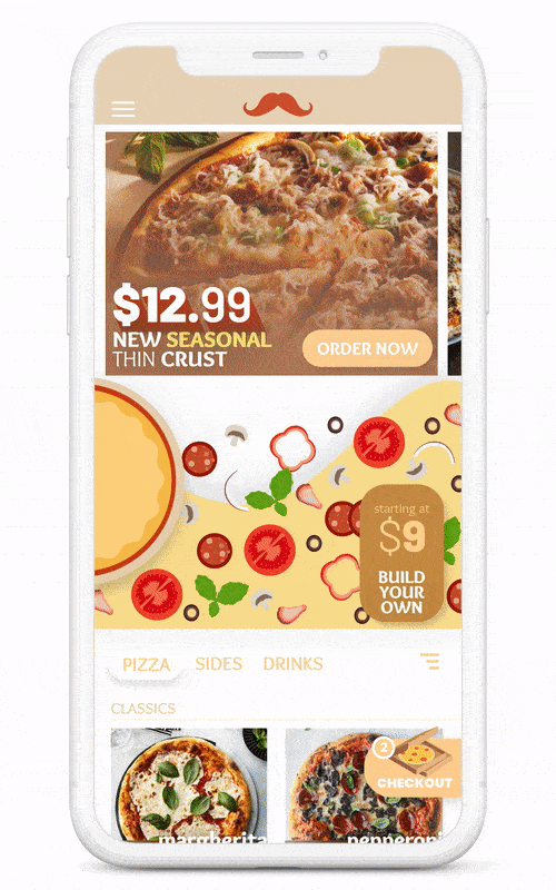
MAIN MENU SCROLL
Customers can scroll through specials, build your own pizza, and the menu. From my research, customization is a key component for users, so the build your own button carries over on the top right even as the user scrolls past that section, allowing for easy access to the feature wherever they are in the interface.
CUSTOMIZING MENU ITEM
Micro-interaction of a menu item pop-up card. Customers can customize and tweak menu items to their preference, allowing for flexibility and personalization without overwhelming them with choices.

BUILD YOUR OWN PIZZA
As gathered from research, customers like customization but too much options overwhelm and discourages them from continuing with the process. This interface allows for customization and ingredients visualization, while keeping a clean and streamlined aesthetics. Visual elements are localized on the pizza, keeping buttons and options minimal


USABILITY TESTING

TEXT SIZE
Participants identified that some texts were too small to comfortably read
VISUAL RECOGITION TEST
Participants were timed for their recognition of the checkout button on my design in comparison to other pizza ordering websites
NAVIGATION
Participants were asked to execute pre-determined tasks to test the design flow
TAKEAWAY
I was able to fix various issues including readability, contrast, visual hierarchy of page titles, user flow and redesign the checkout process
CHALLENGES
PHOTOS
Without the resources for uniform photographs of the pizza, I had to resort to using images from google, which decreases the unity of the media content.
USER RESEARCH
With the limited time frame, it was difficult to recruit participants for user research, especially on the business owner side.
I also wanted to conduct interview at a local Domino’s store, but they couldn’t answer most questions due to protocol.
PRINCIPLE CRASHED
My Principle crashed while working, and it set me back on making micro-interactions.
OPPORTUNITIES
PHOTOS
More unified photos of products to create a coherent visual system
ILLUSTRATIONS
More hand-made illustrations to add character and elevate the artisanal brand
MICROINTERACTIONS/MOTIONS
Add more motion to make interface more interactive and come alive